Getting the most out of your CRM reports
Last updated: May 26, 2026
Pro feature: This feature is available on Pro plans only. If you’d like to upgrade your plan, please contact our support team.
This guide walks through every report in Found — what it shows, and more importantly, how to read it. The reports themselves do the data crunching; the value comes from knowing what to look for.
If you'd rather watch than read, link to the webinar recording (recommended).
In this guide
Five things to know about every report
1. The Enquiry Funnel
2. The Attribution Report
3. The Event Pipeline
4. Closed Insights
5. The Networking Report
6. The Enquiry Map
What's coming next
Five things to know about every report
1. Let the data mature. The funnel report defaults to a 3-month rolling view. That's deliberate. Enquiries take time to progress through the funnel — a residency started in May might have been an enquiry from February. If you set the date range too narrowly, especially at the start of a month, you'll see artificially low conversion rates because the recent enquiries haven't had time to mature.
2. Always read percentages alongside the numbers behind them. A 50% conversion to residency started looks great until you spot it's two move-ins out of four enquiries. Every percentage on every report should be sense-checked against the underlying numbers, which we display in brackets or as bars next to the percentages.
3. Know what's excluded. By default, every report excludes enquiries that aren't genuine care enquiries — job seekers, duplicates, and other non-care close reasons. You'll see the exclusions listed at the top of each report. This means percentages should usually be high (close to 100% at the early stages), so anything significantly below that is worth investigating.
4. Your data is only as good as your team's data hygiene. Several reports rely on your team logging events when prompted (visit booked, assessment booked, residency started). If those modals are dismissed, the data isn't captured. If the numbers feel low, the first place to look is team practice, not the report.
5. You can export everything. Every report has an export button at the top for the full report, and every individual graph or table has its own export button too. Choose CSV (for slicing in Excel) or image (for board packs).
1. The Enquiry Funnel
Use this when: you want to understand how well your team is moving enquiries through the pipeline, and where you're losing them.
What's different from the old Funnel Insights
The old report counted any enquiry that did anything in the date range. That meant an enquiry from six months ago could show up in this month's funnel, inflating conversion rates and making the numbers impossible to reconcile against the Event Pipeline.
The new Enquiry Funnel only counts enquiries that came in during the date range, and shows their current state. The headline number now matches the Event Pipeline exactly.
Heads up: the old Funnel Insights is being deprecated in June 2026. If you're still relying on it for reporting, get in touch and we'll help you transition.
Key views
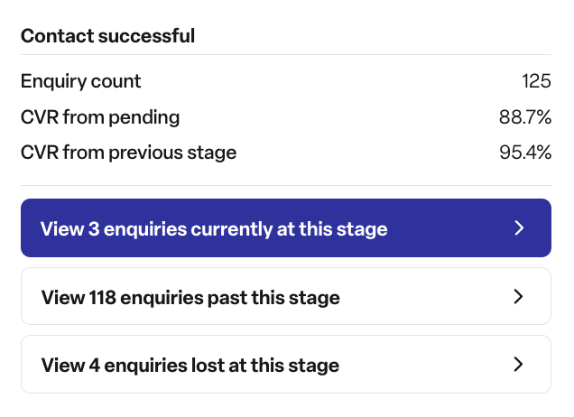
The headline funnel. Your default view. Drill into any stage to see the actual enquiries still at that stage, lost there, or that have moved past it.
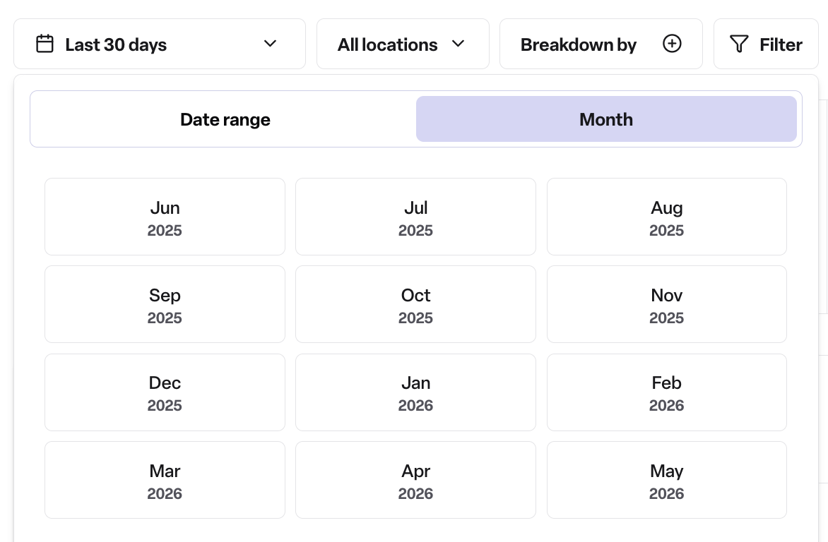
The monthly tabs (right-hand side). A quick way to flip month-by-month if you prefer that to the date picker. Average days to reach each stage are shown at the top — useful for spotting if your team's responsiveness is slipping.
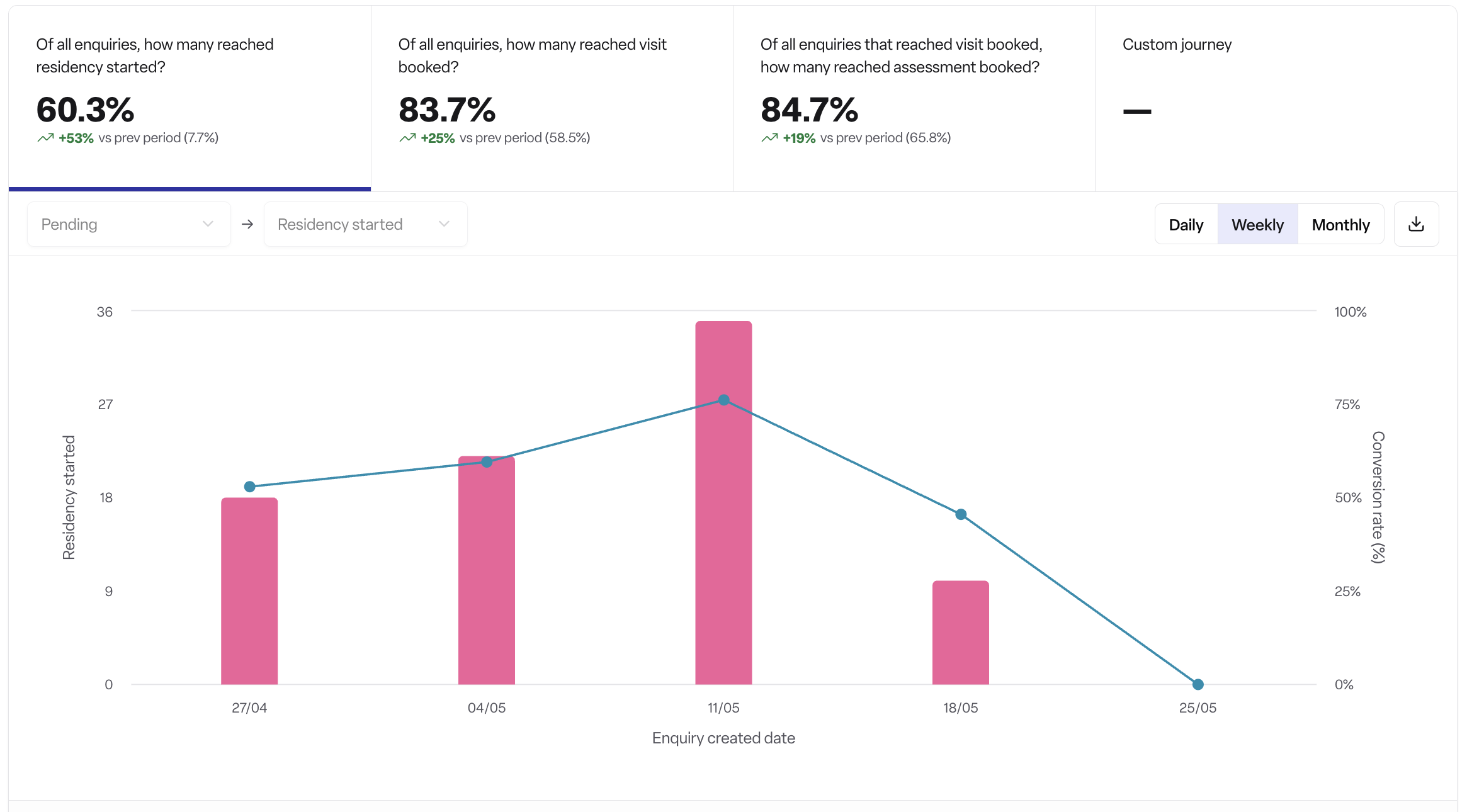
The conversion trend graph. Shows your overall conversion to your end stage over time, with bars indicating volume. Read the two together: a spike in the blue line might just mean three enquiries that month.
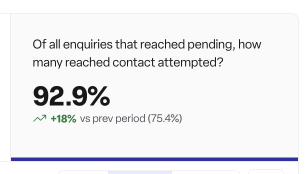
The custom journey tab. The hardest working tab in this report. Pick any two stages and see conversion between them over time. Particularly useful for short-cycle stages — "pending → contact attempted" should be close to 100% all the time. If it isn't, that's an immediate signal to dig in.
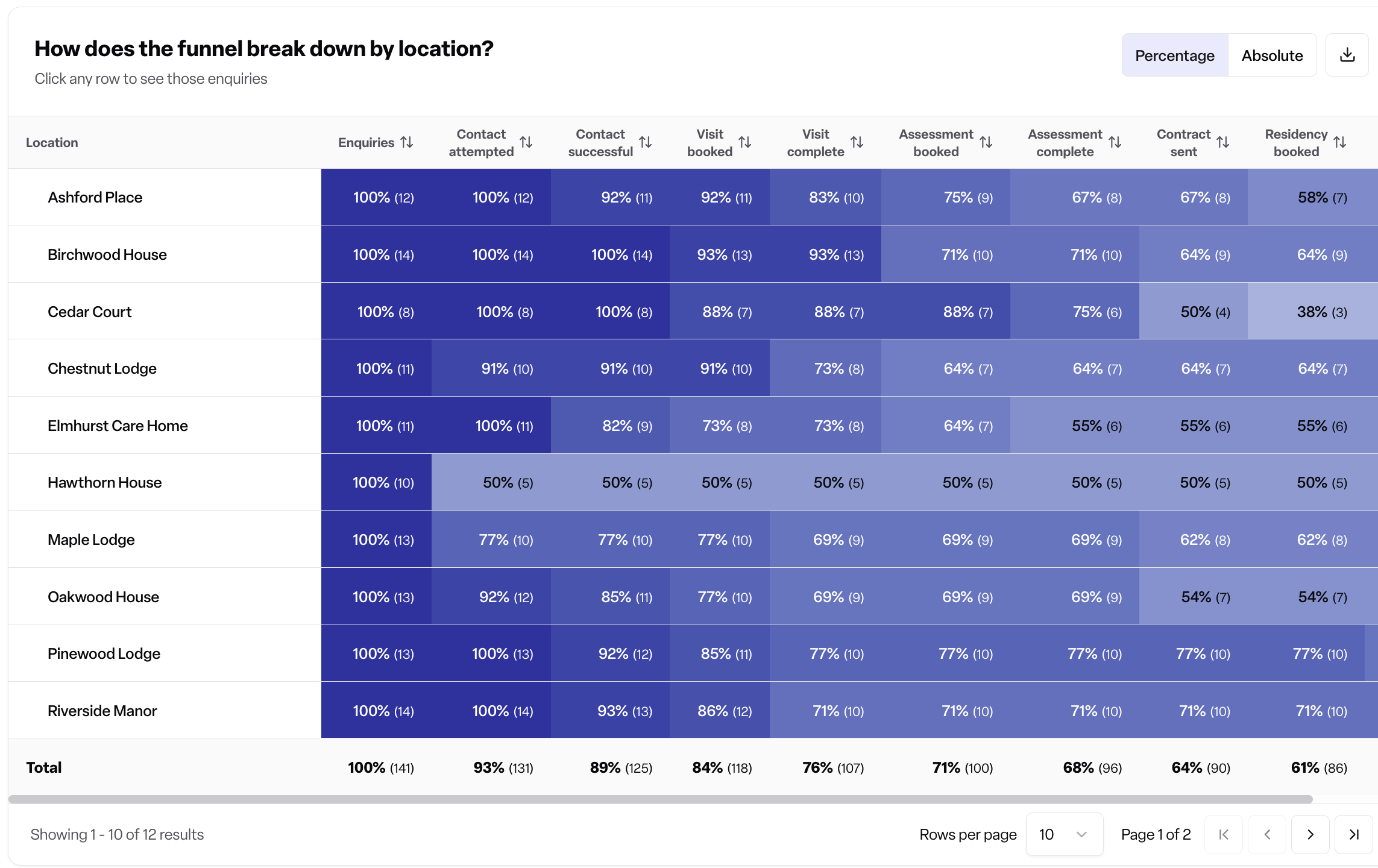
The location breakdown. Colour-coded conversion rates by location across every funnel stage. Two things to look for:
Locations significantly below the pack — likely a training, login, or process issue.
Locations significantly above the pack with low absolute volumes — could mean they're only logging the enquiries they expect to convert. This skews your attribution data and inflates the team's apparent performance.
2. The Attribution Report
Use this when: you want to know which channels are bringing in enquiries — and, more importantly, which ones are bringing in bookings.
The two main toggles
Enquiries vs bookings. At the top of the report, switch between volume of enquiries by channel and volume of bookings by channel. Some channels are great at filling the funnel but poor at converting; others are the opposite. Looking at both tells the full story.
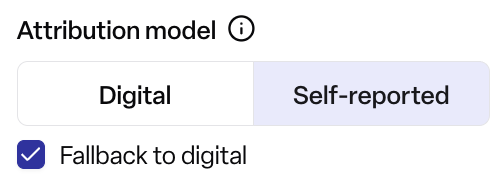
Digital vs self-reported attribution. Found supports two attribution signals:
Digital — Google Click IDs, Facebook Click IDs, and UTM parameters passed through with the enquiry.
Self-reported — the "how did you hear about us" answer the enquirer gives directly.
By default we use self-reported, because it captures the moment that actually drove the enquiry. If someone clicked a paid ad but said "my friend recommended you", we'd attribute it to personal referral. If you'd prefer to favour digital — for example, if you're using attribution for ad spend decisions — switch the preference at the top of the report.
If you're running paid ads and not sending us UTMs or click IDs, please get in touch. Those enquiries will fall into "unattributed", which means you can't see the return on your spend.
Drilling down
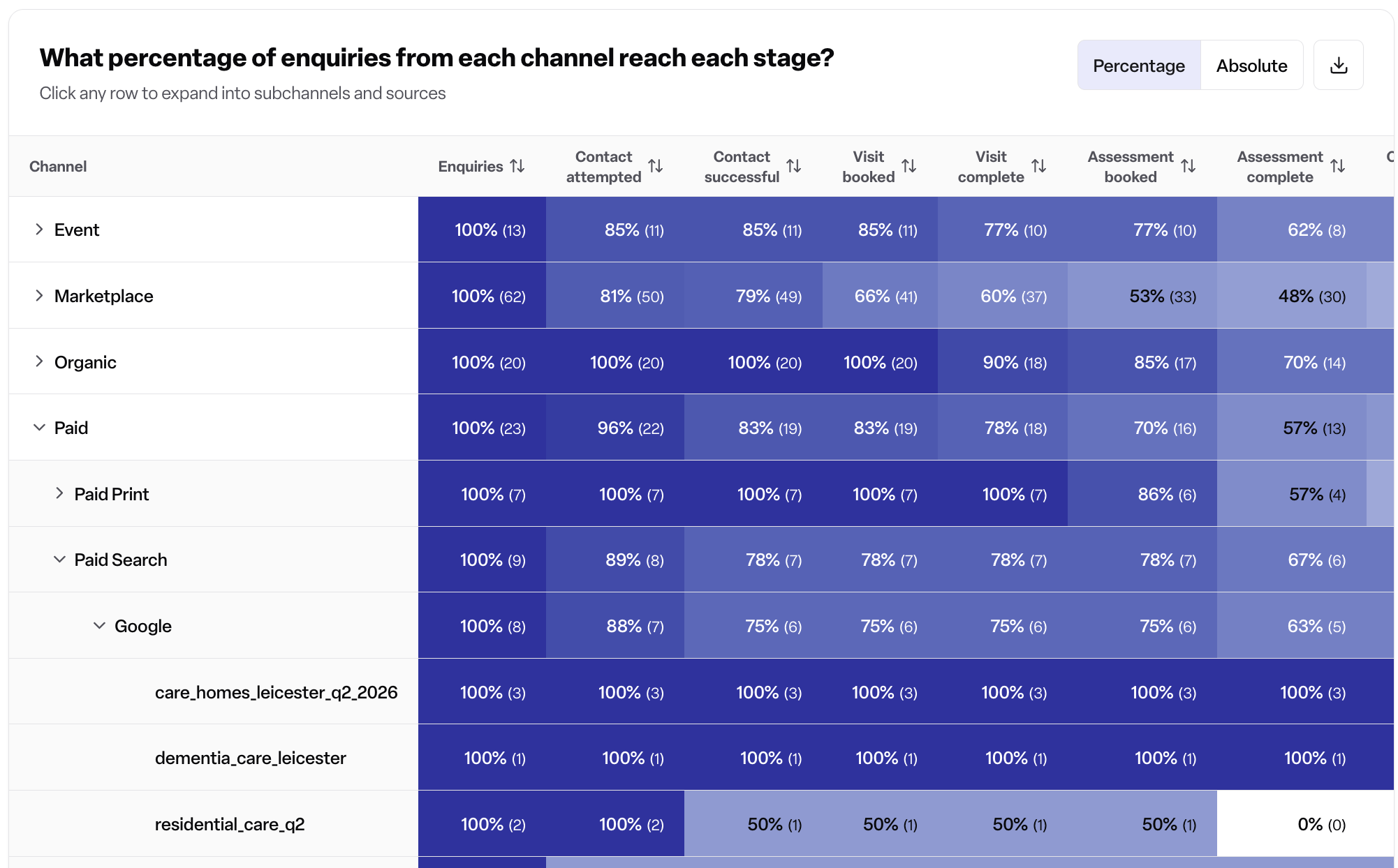
Every channel can be drilled into. Click Referrals to see the split between personal, previous customer, and professional. Click Paid to see which Google campaigns are driving bookings. Click Marketplace to compare performance across the marketplaces you use.
The funnel-by-channel view (same format as the location breakdown in the Enquiry Funnel) lets you spot patterns like "this marketplace gets us great contact rates but no visits" — the kind of insight you can take straight to your account manager.
Stacked bar vs trend line
Toggle between the two at the top. The trend line is better for spotting changes over time; the stacked bar is calmer when you're presenting to a wider audience. Your preference is saved across sessions.
3. The Event Pipeline
Use this when: you want to see the activity happening on your enquiries, not just stage progression.
The four key tabs
New enquiries. Volume coming into the system over time, with the non-care exclusions already applied. Trending up or down?
Interactions. Emails, phone calls, and notes logged by your team, broken down by type. Useful for tracking adoption — for example, after we introduced the Outlook integration, you should see logged emails rise.
Visits. Now broken down by status (completed / pending / cancelled / no show). If a lot of your historical visits are still showing as "pending", they probably need closing off.
Assessments. Same breakdown.
Why doesn't this match the Enquiry Funnel?
A very common question. Short answer:
The Enquiry Funnel tracks stage progression. If an enquiry jumped from pending straight to assessment booked, the funnel counts it as having passed through contact and visit stages too.
The Event Pipeline tracks logged calendar events. If your team moved the stage but dismissed the modal asking for visit details, no event is logged here.
If you're seeing a big gap between funnel visits and event pipeline visits, the most likely cause is that data quality issue. Other legitimate reasons:
Local authority placements that skip the visit stage.
Repeat respite bookings that don't need a new visit.
Bookings
If you're on the occupancy module, bookings are sourced from the booking object directly — more accurate.
If you're on CRM-only, bookings come from the timeline event when an enquiry moves to "residency started". If you're CRM-only and aren't seeing bookings logged, check the team is filling in the residency-started modal rather than dismissing it.
4. Closed Insights
Use this when: you want to understand why and when you're losing enquiries.
Closed lost reasons over time
This used to be a static bar chart. Now you can see reasons as a trend, which is far more useful — a steady rise in "requirements not met" or a sudden spike in "unable to contact" both demand different responses.
If "too expensive" is climbing, ask what's changed. Have you started publishing prices? Pushed through a price increase? If "unable to contact" is spiking, look at whether one location is driving it.
Stage at which you're losing enquiries
A new view showing where in the funnel the losses are happening. Spikes here often correlate with specific events — a marketplace change, a new team member, a training gap.
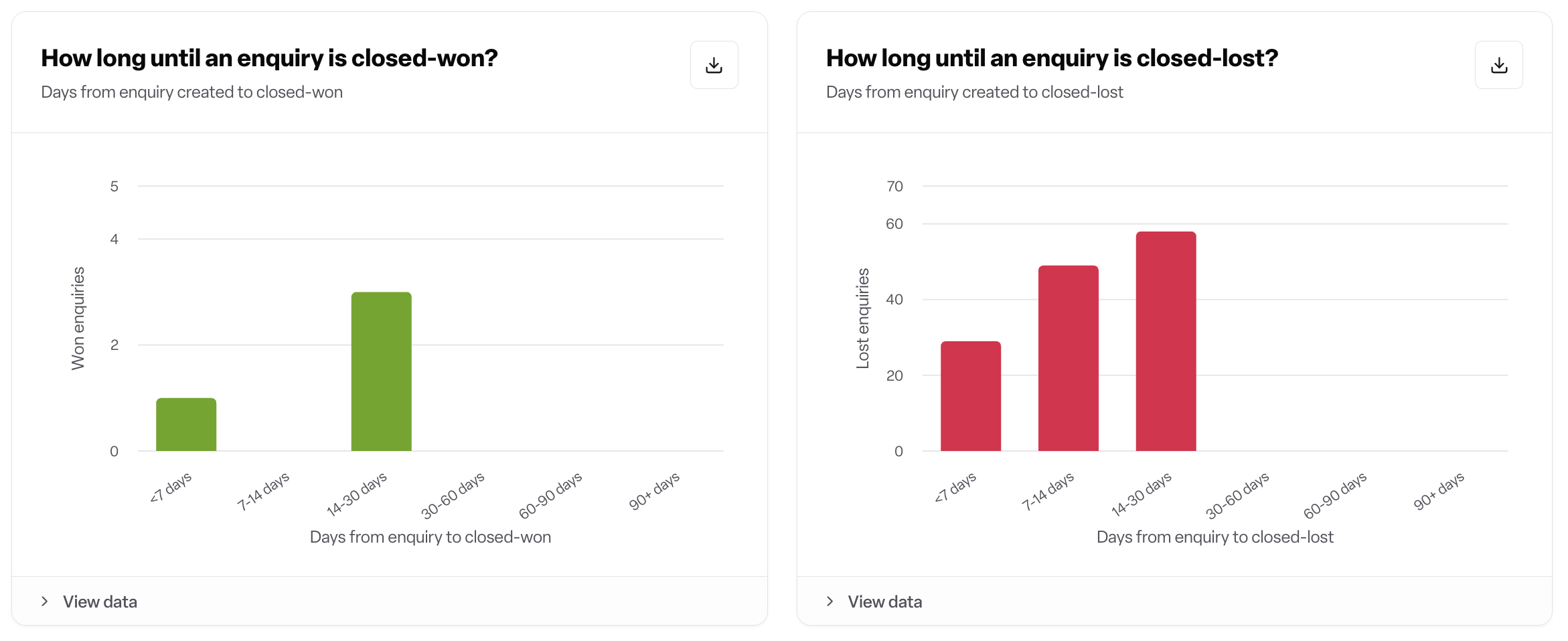
Time to close
This is the chart most people don't know how to read, so it's worth a moment.
A healthy closed-won distribution typically shows two things:
A peak under 7 days (the urgent move-ins).
A long tail at 90+ days (the enquiries you nurtured patiently).
If you see only the early peak and nothing at 90+ days, your team isn't nurturing longer-term enquiries — there's an opportunity to introduce a nurture flow.
On the closed-lost side, watch for an early spike. If lots of enquiries are being closed lost within a week, it often means one email or one phone call went unanswered and the team gave up. Most enquirers need three call attempts and some email nurturing before they engage.
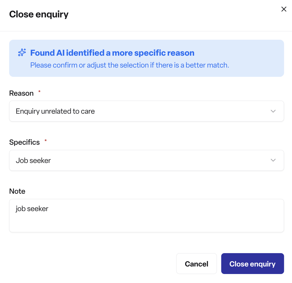
AI categorisation of closed lost reasons
We've started using AI to categorise closed-lost reasons that would previously have ended up in "other". If you look at the trend over a longer window, you'll see "other" drop off a cliff at the point we switched this on, replaced by more useful categories.
5. The Networking Report
Use this when: you set targets for your team around professional referrer relationships.
One of our simpler reports. It shows, per location:
Number of new professionals added (either via a first enquiry or as a contact in their own right).
Number of networking activities logged on those contacts (calls, meetings, emails).
A common target structure is two new professionals per week and five networking activities per week per location. The point isn't just to add contacts — it's to nurture relationships, and the activity log is what tells you whether that's actually happening.
The contact timeline is new, so if your team has been adding professionals but not logging follow-ups, that's the first conversation to have.
6. The Enquiry Map
Use this when: you're planning marketing or brochure drops.
The map plots the contact address of every enquiry. If you've been collecting addresses, you can see exactly where your enquiries are coming from — which is rarely a clean concentric circle around your home.
One partner with a home South of a river found that their closed-won enquiries came almost entirely from North of the river. The instinctive marketing approach would have been to push leaflets South, closer to the home; the data told them to do the opposite.
If your enquiries aren't logging an address, you won't see them here.