Events pipeline
Last updated: July 28, 2026
What is the event pipeline?
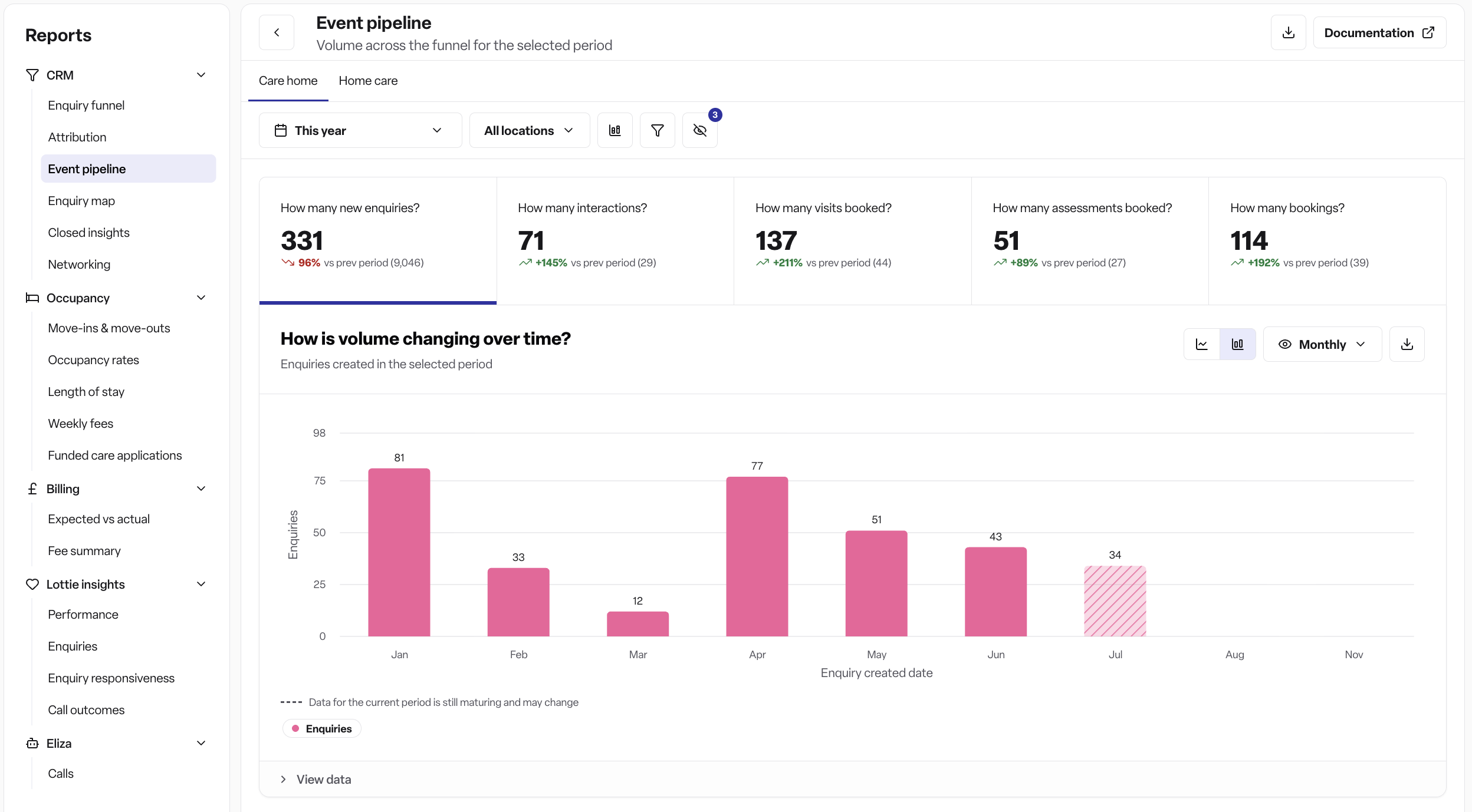
The event pipeline report shows you how enquiries progress through your care journey, from initial contact to booking. It tracks five key stages:
Enquiries - The number of enquiries that were added during the selected period
Interactions (labelled "Contacted" internally, but shown in the product as "Interactions") - The number of interaction events logged — this includes phone call notes, emails sent, SMS sent, and inbound calls tracked automatically via call tracking (not just phone and email)
Visits - The number of visit events logged (not available for home care locations)
Assessments - The number of assessment events logged
Bookings - For workspaces with the Occupancy module enabled, this counts actual bookings by their start date. For workspaces without Occupancy, this counts "care start" events logged on the enquiry instead. This is determined by whether your workspace has Occupancy enabled — not by which location type (care home vs. home care) you're viewing.
Note: Visits, Assessments, and Bookings count every logged event of that type in the period, regardless of its status — including Pending, Cancelled, and No-show, not just ones "marked as complete." Hovering over these metric cards shows a breakdown by status (Completed / Pending / Cancelled / No-show) so you can see that split.
The report also calculates conversion rates between each stage, helping you identify where enquiries may be dropping off in your process.
How to access the event pipeline
Navigate to the Reports tab in Found
Under CRM -> choose Event pipeline
Select your location type (Care homes tab or Home care tab)
Filtering your data
Time range selector
Use the time range selector to choose which period you want to analyse:
Select from preset ranges (e.g. last 7 days, last 30 days, last quarter)
Choose a custom date range
The report will automatically compare your selected period with the previous period of equal length
Location filter
Filter the report by specific locations:
Click the location selector to choose one or more locations
Leave unselected to view data for all locations you have access to
Breakdown options
Use the breakdown selector to group your chart data by different dimensions:
Care duration - Group by length of care commitment
Care type - Split by type of care service
Funding type - Analyse by how care is funded
Method of contact - See how different contact methods perform
Attribution source - Track which marketing/referral channels generate enquiries
Note: "Location" isn't one of the breakdown options above — the data table at the bottom of the report always shows a per-location split by default, independent of whatever breakdown you choose for the chart (see "Data table" below).
Reading the report
Metric cards
At the top of the report, you'll see cards for each stage showing:
The total count for your selected period
The change from the previous period (shown as a percentage)
Colour coding (green for increases, red for decreases)
Click on any metric card to update the chart below to show that metric's trend over time. Hovering over a card (other than Enquiries) shows a further breakdown for that metric.
Trend chart
The chart visualises how your selected metric changes over time. When you've applied a breakdown, the chart will show stacked data for each breakdown category.
Data table
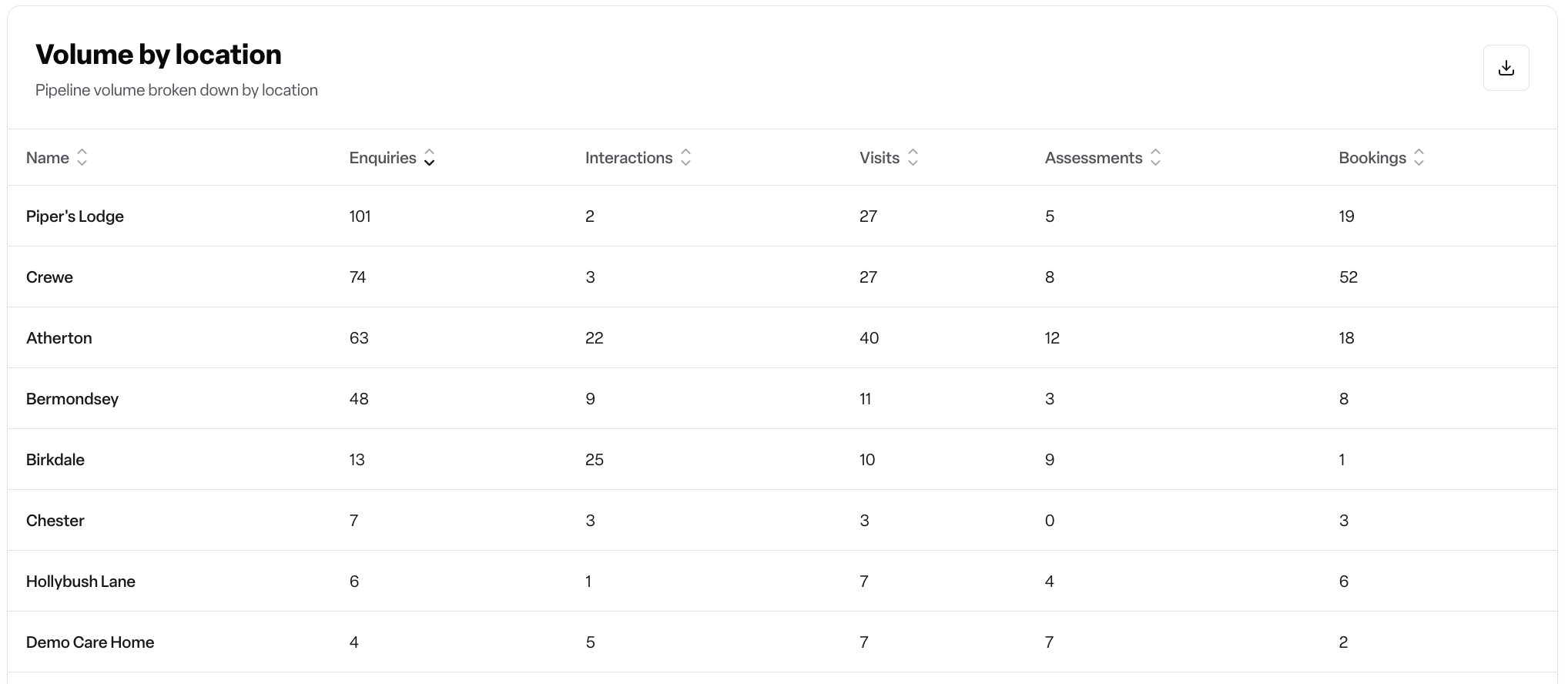
The table at the bottom shows:
Each location (the table is always broken down by location, regardless of the chart breakdown selection above)
Counts for all five metrics
Conversion rates between stages (shown as percentages)
You can sort by any column by clicking the column header
The table remembers your sorting preference
Exporting data
To export the event pipeline report:
Click the "Export" button in the top right corner
The report will download as a CSV file containing:
Report title and date range
Current and previous period metrics with percentage changes
Breakdown data showing all metrics for each category
The filename will include your location type and the date range (e.g.
event-pipeline_care_home-2025-01-01-2025-01-31.csv)
You can open this file in Excel, Google Sheets, or any spreadsheet application for further analysis.
Frequently asked questions
Q: Why don't I see the "Visits" metric for my home care locations? A: Visits are only tracked for care home locations where prospective residents physically visit the facility. For home care services, the enquiry process typically moves directly from contact to assessment, so the visits stage is not shown.
Q: How are conversion rates calculated? A: Conversion rates show the percentage of enquiries that progress from one stage to the next:
Contacted CVR - (Interactions ÷ Enquiries) × 100
Visits CVR - (Visits ÷ Interactions) × 100
Assessments CVR - (Assessments ÷ Visits) × 100
Bookings CVR - (Bookings ÷ Assessments) × 100
Q: What counts as "Interactions"? A: This metric includes phone call notes, emails sent, SMS sent, and inbound calls automatically tracked via call tracking — not just phone calls and emails. It counts these regardless of whether the enquiry has otherwise progressed.
Q: Why do my numbers look different from last month's report? A: The report shows data based on when events were logged, not when enquiries were originally created. For example, if a visit was logged in the current period but the enquiry was created last month, it will count towards the current period's visit metric. It also counts events regardless of status (completed, pending, cancelled, or no-show all count).
Q: Can I view data from more than 12 months ago? A: Yes, you can use the custom date range selector to choose any historical time period. However, very long date ranges may take longer to load.
Q: The report shows no data - what should I check? A: If you're not seeing any data:
Confirm you've selected the correct time range
Check that you have access to at least one location
Verify that enquiries and events have been logged in the system for the selected period
Try removing any location or breakdown filters to see if data appears
Q: Can I compare two different time periods? A: Yes, the report automatically compares your selected period with the previous period of equal length. For example, if you select the last 30 days, it will compare against the 30 days before that. The percentage changes shown on the metric cards reflect this comparison.
Q: What's the difference between breaking down by "attribution source" and "method of contact"?
Attribution source shows which marketing/referral channels brought the enquiry to you (e.g. website, referral, advertisement)
Method of contact shows how the person reached out to you (e.g. phone call, email, web form)
These are independent dimensions - an enquiry might have an attribution source of "Website" but a method of contact of "Phone call".