Understanding your Found Dashboard
Last updated: June 9, 2026
Pro feature: This feature is available on Pro plans only. If you’d like to upgrade your plan, please contact our support team.
Overview
The Found dashboard is your at-a-glance view of what is happening across your care business right now. It brings together the key numbers that matter most - from enquiries and occupancy to tasks and fees - so you can start each day knowing exactly where things stand without having to run multiple reports.
⚠ Important: The dashboard is for Found Pro users only
What the dashboard shows
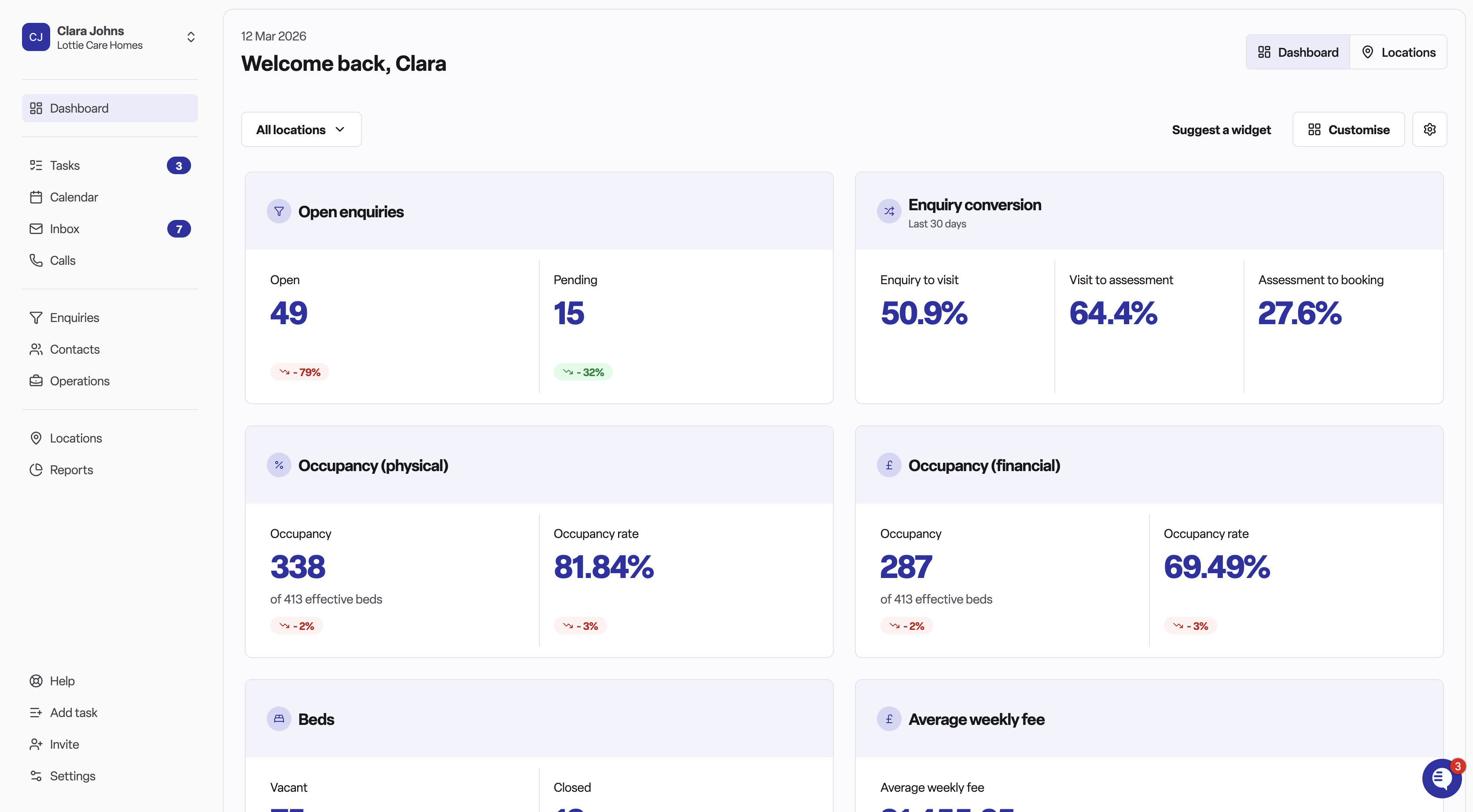
The dashboard is made up of widgets - individual metric cards, each covering a specific area of your business. Which widgets appear depends on your location type (care home, home care), and some widgets may be hidden by default.
Care home widgets
Open enquiries
Shows the number of enquiries currently open and those pending a follow-up. A trend badge indicates whether this number has gone up or down compared to the previous period. Click any figure to go straight to your open enquiries list.Closed enquiries
Shows how many enquiries were closed as won or lost in the last seven days. Useful for understanding recent conversion activity at a glance.Enquiry conversion
Shows your conversion rate as a percentage over the last 30 days. This tells you what proportion of enquiries are resulting in a booking. You can click through to the funnel insights report for more detail.Occupancy – physical
Shows the number of occupied beds and your current physical occupancy rate as a percentage. The subtitle confirms what "effective beds" means for your home. Click through to the occupancy rates report.Occupancy – financial
Similar to physical occupancy, but calculated on a financial basis. Helpful for understanding revenue-generating occupancy rather than just bed counts.Beds
Shows the number of vacant and closed beds, with context about your total effective bed count. Clicking through takes you to the rooms section in operations.Average weekly fee
Shows the average agreed weekly fee across your residents, formatted as a currency figure. Trends show whether this is moving up or down. Click through to the agreed fees report.Task status
Shows a count of your tasks broken down by status — including overdue and pending tasks. Keeping an eye on this helps ensure nothing slips through the cracks.
Home care widgets
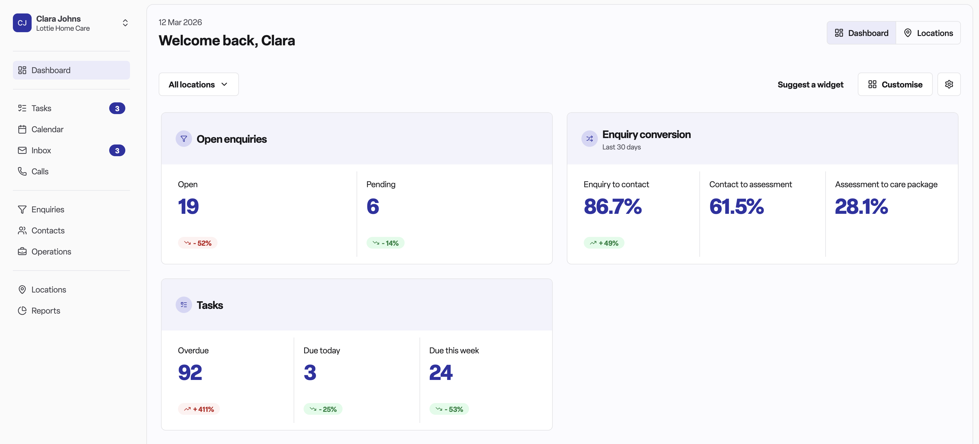
Home care locations see a focused set of widgets: open enquiries, enquiry conversion, and task status.
The locations view
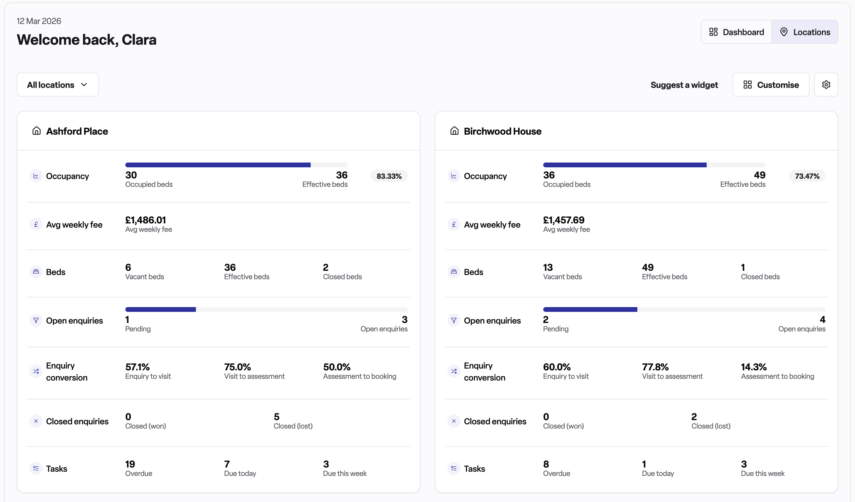
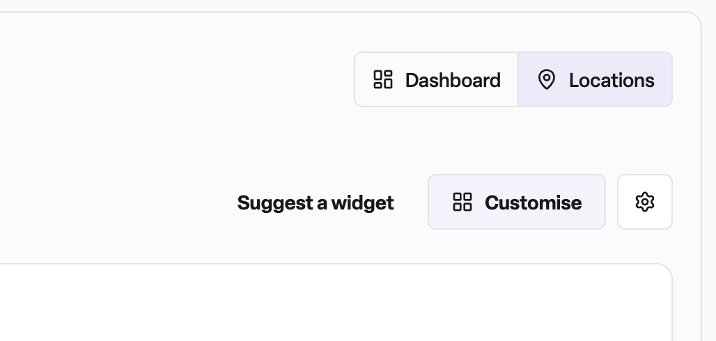
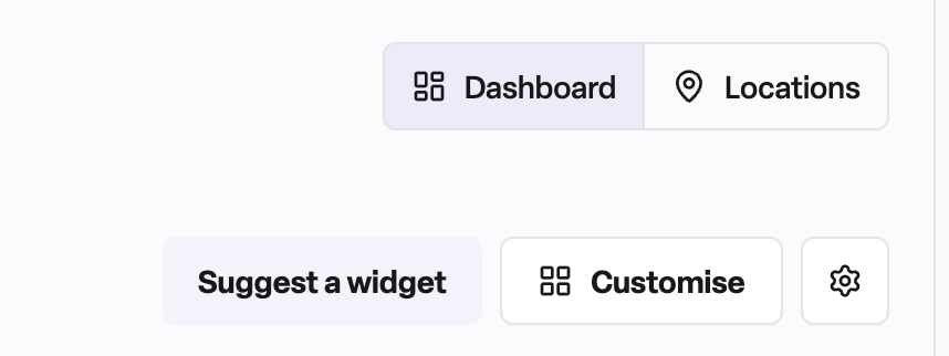
If your workspace covers more than one location, a Locations tab appears next to the Dashboard tab in the header. Switching to this view shows a card for each location with all its key metrics displayed side by side. This is useful for area managers or anyone responsible for multiple homes who wants to compare performance across sites quickly.
Drilling down into the detail
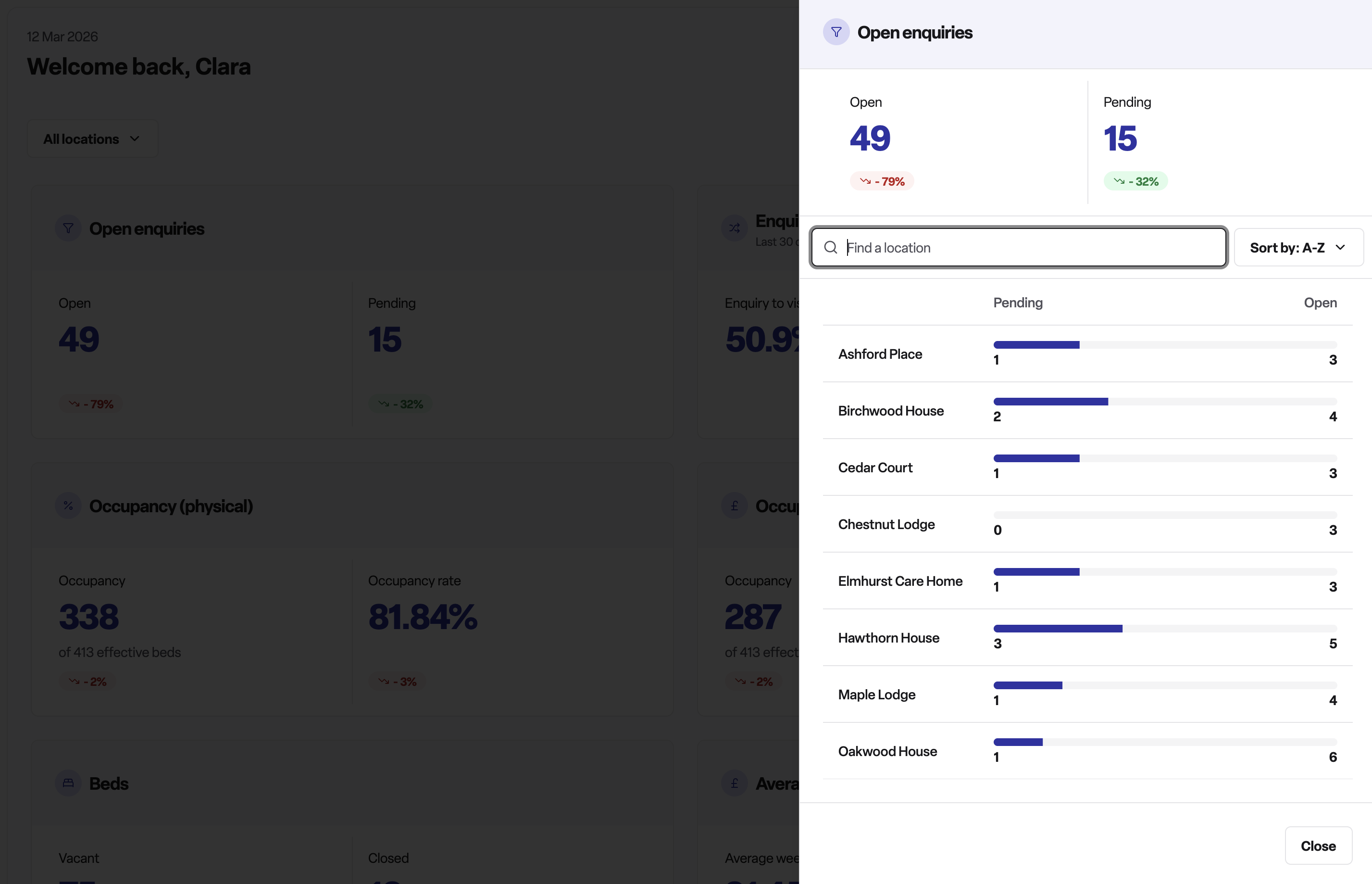
Each widget has a clickable header that opens a breakdown panel on the right-hand side. This panel shows the same metric split out by individual location, so you can see at a glance which sites are driving the overall figure. Within the panel you can:
Search by location name
Sort results (A–Z, Z–A, highest value, lowest value)
Filtering by location
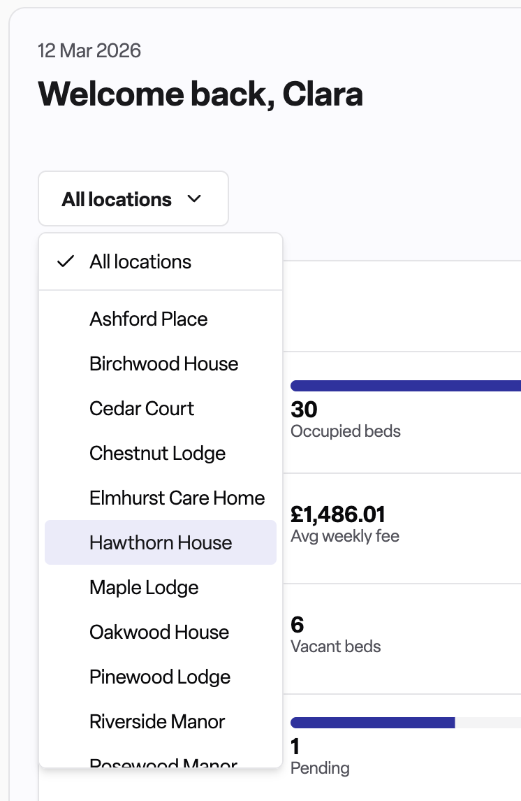
At the top of the dashboard is a location selector. If you manage multiple locations, you can use this to filter all widgets to show data for only the locations you select. The widgets update immediately when you change your selection.
Customising your dashboard
You can tailor the dashboard to show only the widgets most relevant to you:
Click the Customise button in the top-right area of the dashboard.
The dashboard enters edit mode. You can drag widgets to reorder them and toggle individual widgets on or off.
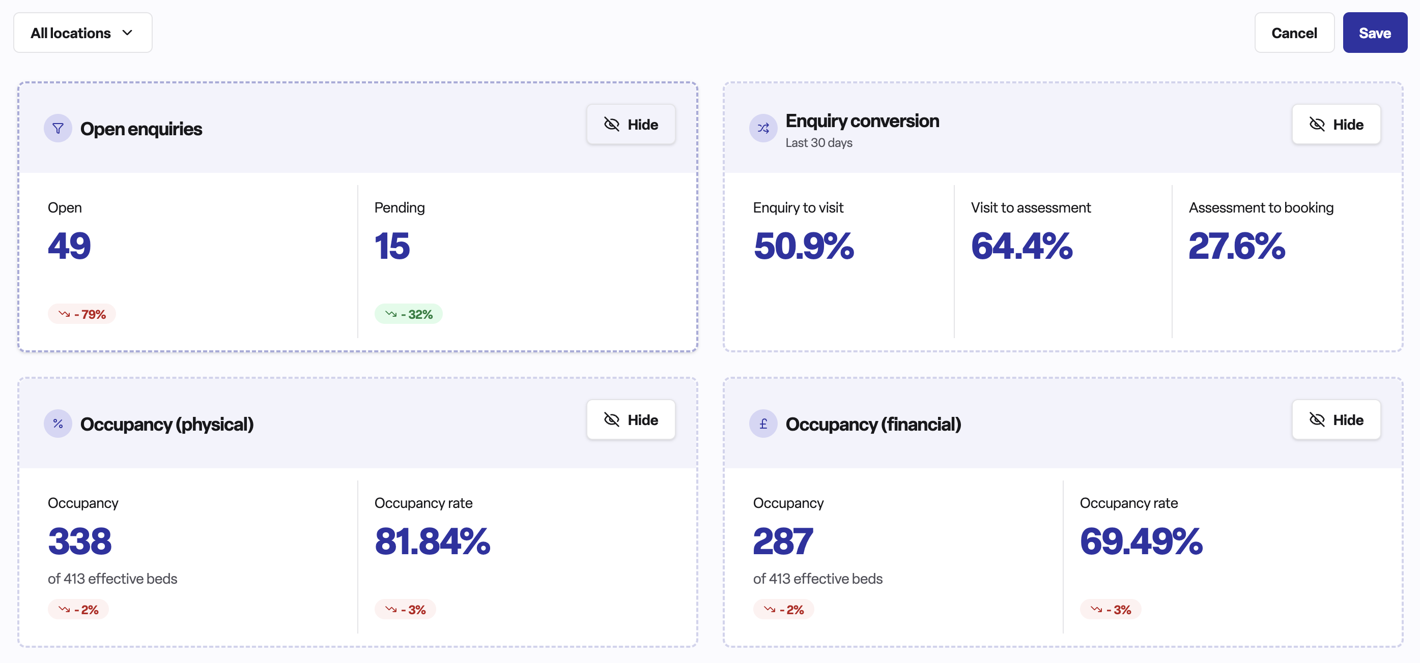
Click Save when you are happy with the layout.
Your configuration is saved to your browser, so it persists between sessions on the same device.
Setting targets (admins only)
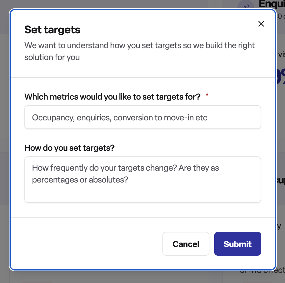
Admin users have access to a Settings menu on the dashboard (the gear icon). From here, admins can configure targets for metrics. Targets give the team something to aim for and provide a benchmark against which current performance can be compared.
Suggesting a new widget
If there is a metric you would like to see on the dashboard that is not currently available, you can submit a suggestion directly from the dashboard. Look for the Suggest a widget option and describe what you would find useful. Suggestions are reviewed by the Found team.
Frequently asked questions
Q: Why can't I see the dashboard?
A: The dashboard is only available to Found Pro users. If you cannot see it, speak to your system administrator to check whether it has been enabled for your workspace.
Q: The numbers on my dashboard look different from the numbers in a report I ran. Why?
A: Dashboard widgets often cover a specific time window (for example, closed enquiries covers the last seven days; enquiry conversion covers the last 30 days). Reports may use different date ranges or filters. Always check the time period a widget is measuring before comparing it to a report.
Q: I customised my dashboard but the changes have gone after I logged in on a different computer. Why?
A: Dashboard layout preferences are saved in your browser's local storage. They are device-specific, so changes made on one machine will not carry over to another.
Q: Can I see data for just one of my locations?
A: Yes. Use the location selector at the top of the dashboard to filter widgets to one or more specific locations.
Q: What does the trend badge on a widget mean?
A: The trend badge shows how the current figure compares to the equivalent previous period. A green upward badge means the number has increased; a downward badge means it has decreased. Whether an increase is positive or negative depends on the metric - for example, an increase in vacancies may be a concern, while an increase in conversions is good news.
Q: I can see an "Occupancy - physical" widget but not an "Occupancy - financial" widget. How do I show it?
A: The financial occupancy widget is hidden by default. Click Customise, find the widget in the list, toggle it on, and save your configuration.
Q: Who can set targets on the dashboard?
A: Only admin users have access to the target-setting feature. If you need targets configured, ask your workspace administrator.
Q: Can I suggest a metric that isn't currently on the dashboard?
A: Yes. Use the Suggest a widget option on the dashboard to submit your idea directly to the Found team.